adlane.io
brand identity, logo, web design, ui kit, brand guidelines
01
about Adlane
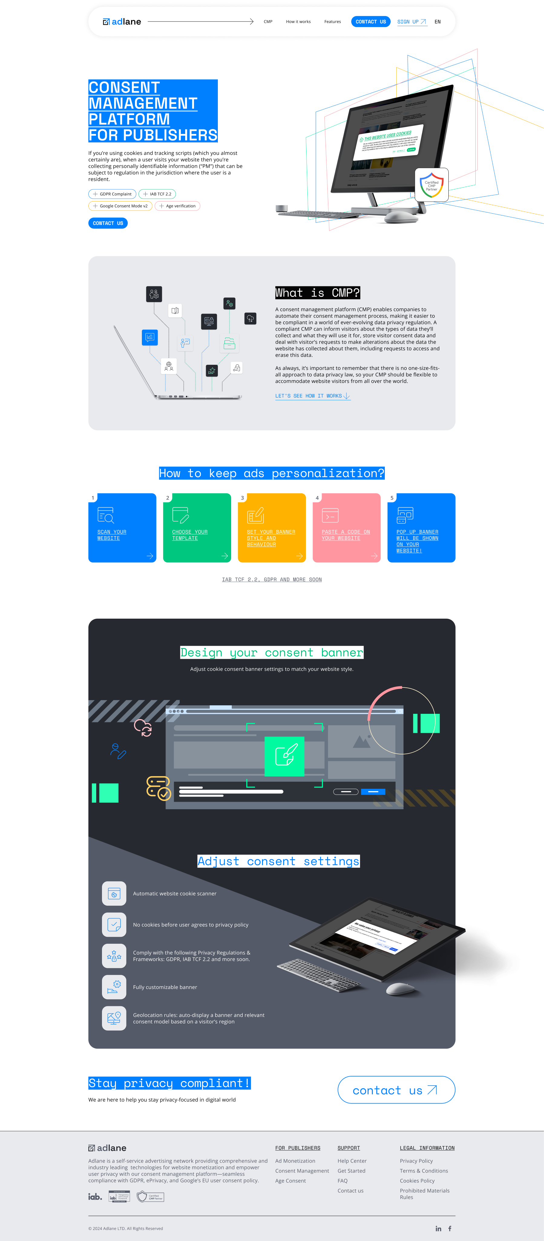
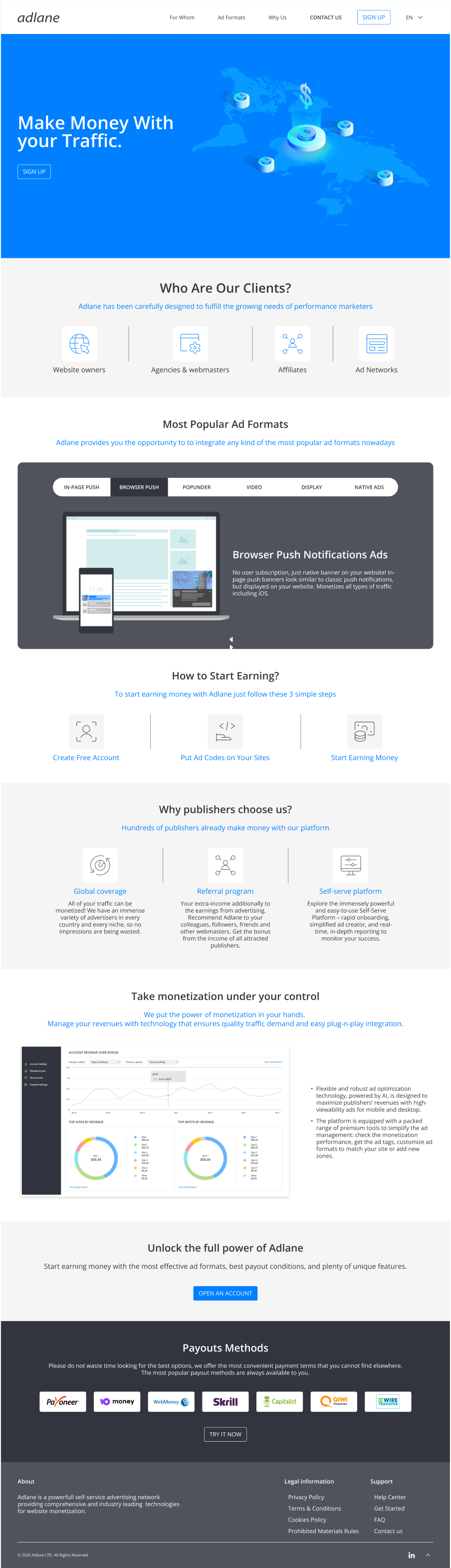
Adlane is a consent management platform (CMP) designed to help websites comply with privacy regulations such as GDPR, IAB TCF 2.2, and Google Consent Mode v2. The platform allows publishers to manage user consent, configure cookie banners, and handle privacy preferences while maintaining advertising and analytics functionality.
02
the challenge
Adlane had been launched quite a long time ago and had significantly expanded over the years. However, its visual identity was never originally designed with long-term growth in mind.
The product design was mostly technical and functional — it worked, but it lacked personality, memorability, and emotional impact. It didn’t create a strong visual impression or feel like something people would genuinely want to share or showcase.
03
what was done
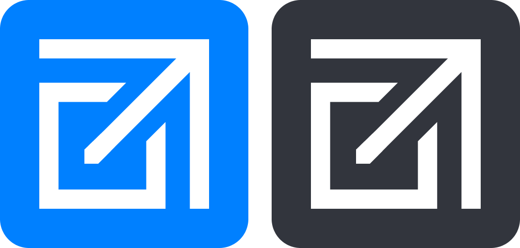
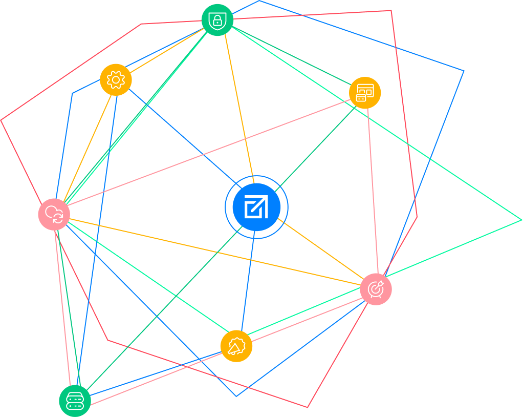
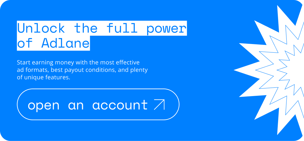
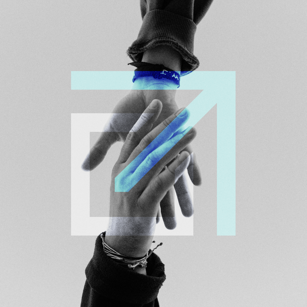
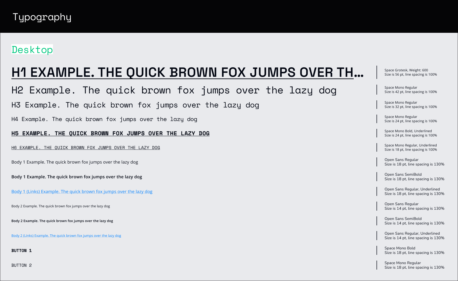
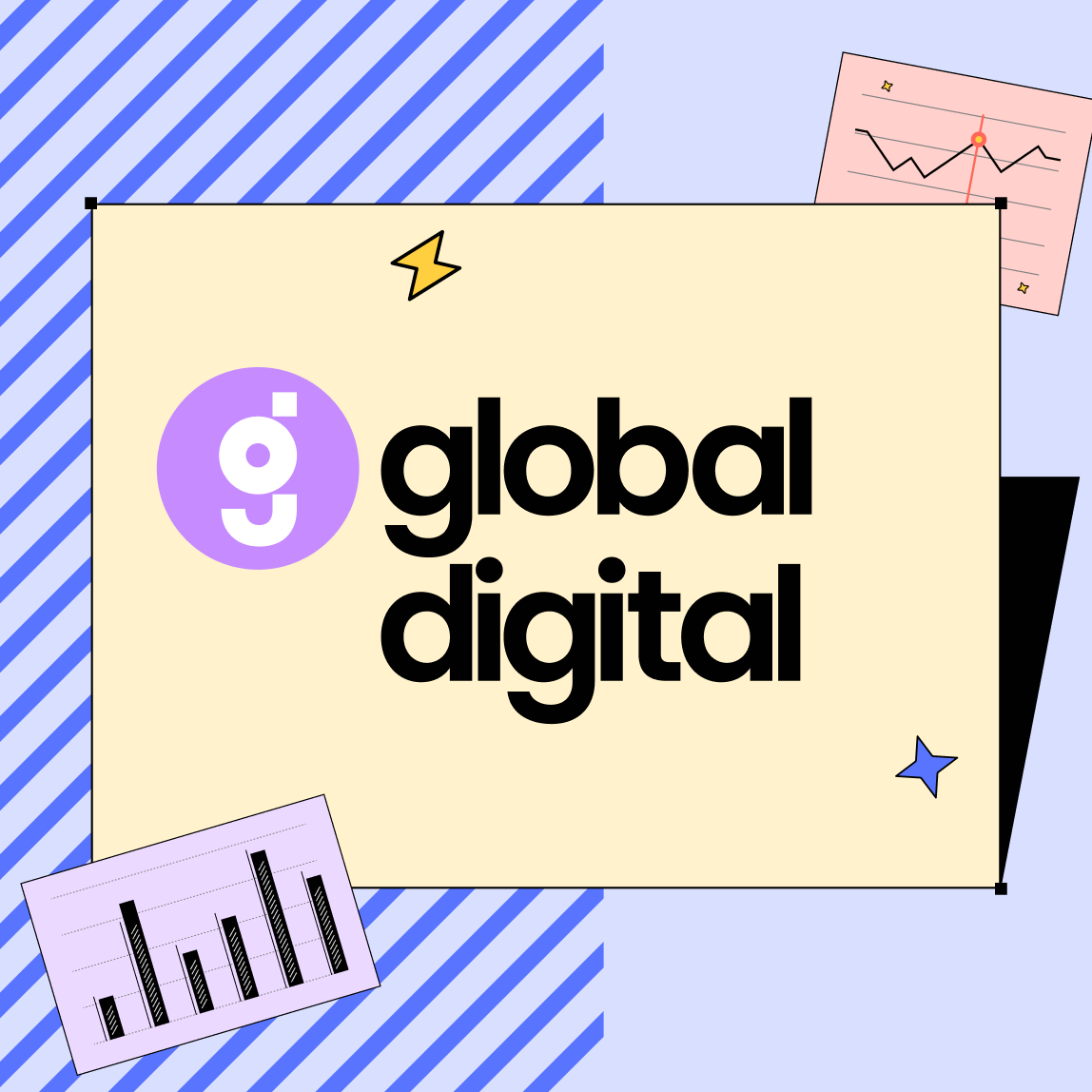
A complete visual identity system was developed for the product, including a new logo, an updated color palette, custom web icons, and visual guidelines for working with illustrations and photo materials.
The project also included refining the overall visual language and establishing a more scalable and recognizable design direction for future product growth.

Take a Look!
next case →
Works
adlane.io
brand identity, logo, web design, ui kit, brand guidelines
about Adlane
01
Adlane is a consent management platform (CMP) designed to help websites comply with privacy regulations such as GDPR, IAB TCF 2.2, and Google Consent Mode v2. The platform allows publishers to manage user consent, configure cookie banners, and handle privacy preferences while maintaining advertising and analytics functionality.
the challenge
02
Adlane had been launched quite a long time ago and had significantly expanded over the years. However, its visual identity was never originally designed with long-term growth in mind.
The product design was mostly technical and functional — it worked, but it lacked personality, memorability, and emotional impact. It didn’t create a strong visual impression or feel like something people would genuinely want to share or showcase.
what was done
03
A complete visual identity system was developed for the product, including a new logo, an updated color palette, custom web icons, and visual guidelines for working with illustrations and photo materials.
The project also included refining the overall visual language and establishing a more scalable and recognizable design direction for future product growth.
Take a Look!

← previous case
next case →
Let’s get in touch!
[email protected]
tsyvinsky
Telegram
tsyvinsky
dmitry_tsyvinsky